Code
d = read.csv("../../data/SaratogaHouses.csv")
d$price = d$price/1000; d$livingArea = d$livingArea/1000
plot(d$livingArea,d$price, 'p', pch=20, col="blue") 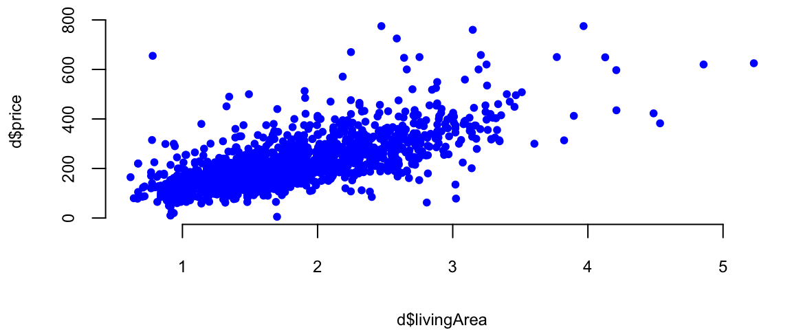
\[ \newcommand{\prob}[1]{\operatorname{P}\left(#1\right)} \newcommand{\Var}[1]{\operatorname{Var}\left(#1\right)} \newcommand{\sd}[1]{\operatorname{sd}\left(#1\right)} \newcommand{\Cor}[1]{\operatorname{Corr}\left(#1\right)} \newcommand{\Cov}[1]{\operatorname{Cov}\left(#1\right)} \newcommand{\E}[1]{\operatorname{E}\left(#1\right)} \newcommand{\defeq}{\overset{\text{\tiny def}}{=}} \DeclareMathOperator*{\argmax}{arg\,max} \DeclareMathOperator*{\argmin}{arg\,min} \DeclareMathOperator*{\mini}{minimize} \]
Francis Galton, a polymath with interests ranging from statistics and psychology to meteorology and eugenics, made significant contributions to the field of statistical analysis. One of the concepts he developed was the regression towards the mean. This concept describes the tendency of extreme values in a population to become closer to the average in subsequent generations. Galton also developed the correlation coefficient, a measure of the linear relationship between two variables. This tool has become a fundamental concept in statistics and is used in various fields to analyze relationships between variables. Galton’s contributions to statistical analysis were numerous and profound. He not only developed new methodologies and techniques but also promoted a data-driven approach to research that continues to shape statistical practice today. Furthermore, he introduced the concept of quantiles, which divide a population into equal-sized subpopulations based on a specific variable. This allowed for a more nuanced analysis of data compared to simply considering the mean and median. He also popularized the use of percentiles, which are specific quantiles used to express the proportion of a population below a certain value. One of the main tools used by Galton was arguably a simplest predictive model for regression, the linear model. It is a linear combination of the input variables. \[ f(x) = \beta_0 + \beta_1 x_1 + \beta_2 x_2 + \ldots + \beta_p x_p \] where \(\beta_0,\ldots,\beta_p\) are the model parameters and \(x_1,\ldots,x_p\) are the input variables. When the model parameters are estimated from the training data using least squares loss function, the estimated values are called the ordinary least squares (OLS) estimates.
Galton used regression analysis to show that the the offspring of exceptionally large or small seed size of sweet peas from tended to be closer to the average size. He also used it for family studies and investigated the inheritance of traits such as intelligence and talent. He used regression analysis to assess the degree to which these traits are passed down from parents to offspring.
Galton, along with Karl Pearson and F. Y. Edgeworth, were pioneers in the development of multiple regression and correlation analysis. These techniques helped quantify the relationships between multiple variables, providing valuable insights in social science research. Additionally, Galton developed family study methods to analyze the inheritance of traits, laying the groundwork for the study of genetics.
Galton’s overall approach to statistics was highly influential. He emphasized the importance of quantitative analysis, data-driven decision-making, and empirical research, which paved the way for modern statistical methods and helped to establish statistics as a recognized scientific discipline.
Example 11.1 To demonstrate linear regression we develop a model that predicts the price of a house, given its square footage. This is a simplified version of a regression model used by Zillow, a house pricing site. First, we look at property sales data where we know the price and some observed characteristics. Let’s look at the scatter plot of living areas measure in squared feet and the price measured in thousands of dollars.
Second, we build a model that predicts price as a function of the observed characteristics. Now, we need to decide on what characteristics do we use. There are many factors or variables that affect the price of a house, for example location. Some other basics ones include size, number of rooms, and parking.
We will use the SaratogaHouses dataset from the mlbench package. This dataset contains information about house sales in Saratoga County, New York, between 2004 and 2007. The dataset contains 1,172 observations and 16 variables. We will use the price variable as the dependent variable and the livingArea variable as the independent variable. The price variable contains the sale price of the house in thousands of dollars, and the livingArea variable contains the living area of the house in square feet. \[
\mathrm{price} = \beta_0 + \beta_1 \mathrm{livingArea}
\]
The value that we seek to predict,price, is called the dependent variable, and we denote this by \(y\). The variable that we use to construct our prediction, livingArea, is the predictor variable, and we denote it with \(x\). Typically, we use those notations to write down the formulas \[
y = \beta_0 + \beta_1 x.
\]
First, let’s see what’s does the data look like?
d = read.csv("../../data/SaratogaHouses.csv")
d$price = d$price/1000; d$livingArea = d$livingArea/1000
plot(d$livingArea,d$price, 'p', pch=20, col="blue")
We use lm function to estimate the parameters of the line
l = lm(price ~ livingArea, data=d)
plot(d$livingArea, d$price, 'p', pch=20, col="blue", xlab="Living Area", ylab="Price")
abline(l, col="red", lwd=3)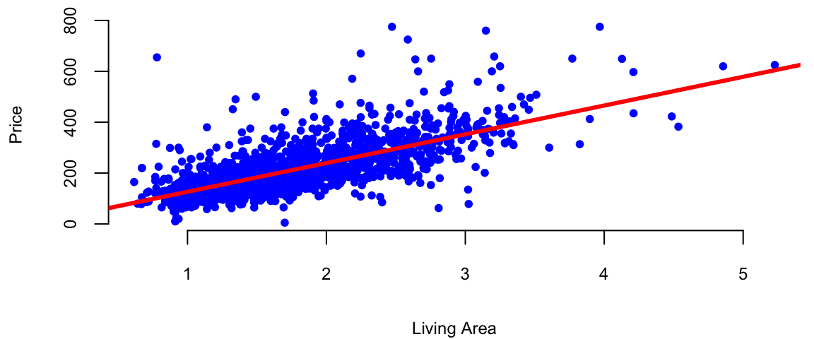
This R code is fitting a linear regression model using the lm function. Let’s break down the code:
lm: This is the function used for fitting linear models, it used least squares loss function.
price: This is the dependent variable, the variable you are trying to predict. It is assumed to be in the dataset specified by the data argument.
~: In the context of the formula inside lm, the tilde (~) separates the dependent variable from the independent variable(s).
livingArea: This is the independent variable or predictor. In this case, the model is trying to predict the variable price based on the values of livingArea.
data = d: This specifies the dataset that contains the variables price and livingArea. The dataset is named d.
So, in plain English, this R code is fitting a linear regression model where the price is predicted based on the livingArea in the dataset d. The model is trying to find a coefficient for livingArea to minimize the difference between the predicted values and the actual values of price.
We can use coef function to find out the slope and the intercept of this line.
coef(l)(Intercept) livingArea
13 113 The intercept value is in units of \(y\) ($1000). The slope is in units of \(y\) per units of \(x\) ($1000/1 sq. feet). In our housing example, we find that \(\beta_0 = 13.44\) and \(\beta_1 =113.12\). Thus, every \(1000\) sqft increase the price of the hous by $1.34^{4} and the price of a lot of land without a house is 113.12. The magnitude of \(\beta_1\) shows the economic significance of house’s square footage.
We can now predict the price of a house when we only know that size: take the value off the regression line. For example, given a house size of \(x = 2.2\). Predicted Price: \[ \hat{y} = 13.44 + 113.12 \times 2.2 = 262.31 \]
plot(d$livingArea, d$price, 'p', pch=20, col="blue", xlab="Living Area", ylab="Price")
abline(l, col="red", lwd=3)
# Draw a line between the two points
x = 2.2
yhat = x*coef(l)[2]+coef(l)[1]
lines(c(x,x), c(0,yhat), col="green", lwd=3, lty=2)
lines(c(0,x), c(yhat,yhat), col="green", lwd=3, lty=2)
text(x-0.7,yhat+30, TeX("$\\hat{y} =  262.3$"), cex=1.5)
As we have discussed at the beginning of this chapter the predictive rule can be used for two purposes: prediction and interpretation. The goal of interpretation is to understand the relationship between the input and output variables. The two goals are not mutually exclusive, but they are often in conflict. For example, a model that is good at predicting the target variable might not be good at interpreting the relationship between the input and output variables. A nice feature of a linear model is that it can be used for both purposes, unlike more complex predictive rules with many parameters that can be difficult to interpret.
Typically the problem of interpretation requires a simpler model. We prioritize models that are easy to interpret and explain, even if they have slightly lower predictive accuracy. Also, evaluation metrics are different, we typically use coefficient of determination (R-squared) or p-values, which provide insights into the model’s fit and the significance of the estimated relationships.
The choice between using a model for prediction or interpretation depends on the specific task and desired outcome. If the primary goal is accurate predictions, a complex model with high predictive accuracy might be preferred, even if it is less interpretable. However, if understanding the underlying relationships and causal mechanisms is crucial, a simpler and more interpretable model might be chosen, even if it has slightly lower predictive accuracy. Typically interpretive models are used in scientific research, social sciences, and other fields where understanding the underlying causes and relationships is crucial.
In practice, it’s often beneficial to consider both prediction and interpretation when building and evaluating models. However, it is not unusual to build two different models, one for prediction and one for interpretation. This allows for a more nuanced analysis of the data and can lead to better insights than using a single model for both purposes.
Below we consider a linear model that allows us to understand the relations between the input and output variables.
Example 11.2 (Keynes Investment Performance) John Maynard Keynes was a good investor, achieving a long-term average annual return of 16% while managing the King’s College Cambridge endowment fund from 1921 to 1946. This performance significantly outperformed the overall market during that period. In the 1921-1929 period he experimented with investments in art and currency, as well as cyclical equity investing. However, later in 1930s and onwards Keynes transitioned to a value investing strategy, focusing on undervalued stocks with strong fundamentals. This coincided with the Great Depression, where such investments offered significant opportunities. This shift led to consistent outperformance, with the King’s College endowment generating returns exceeding the market on average. In our analysis we consider his returns during the 1928-1945 period. Below is the plot of his returns.
keynes = read.csv("../../data/keynes.csv",header=T)| Year | Keynes | Market | Rate |
|---|---|---|---|
| 1928 | -3.4 | 7.9 | 4.2 |
| 1929 | 0.8 | 6.6 | 5.3 |
| 1930 | -32.4 | -20.3 | 2.5 |
| 1931 | -24.6 | -25.0 | 3.6 |
| 1932 | 44.8 | -5.8 | 1.5 |
| 1933 | 35.1 | 21.5 | 0.6 |
attach(keynes)
# Plot the data
plot(Year,Keynes,pch=20,col=34, cex=3, type='l')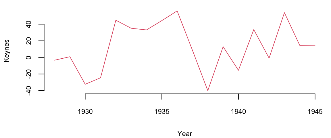
mean(Keynes) 13Let’s compare his performance to the overall stock market. The Dow Jones Industrial Average, grew at an average annual rate of 8.5% during the same period (1921-1946). Keynes was able to consistently generate alpha, exceeding the market’s overall returns.
The plot below shows the relationship scatterplot of the maket returns vs Keynes portfolio returns. The correlation coefficient is 0.76, which is high, when markets are doing well, Keynes did also well.
plot(Market, Keynes, xlab="Market Return", ylab="Keynes Excess Return",col=20, pch=16)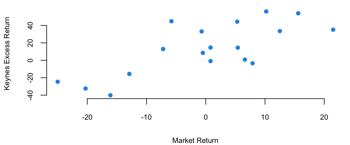
The correlation coefficient is
cor(Keynes,Market) 0.74Now we fit a liner regression model \[ \text{Keynes} = \alpha + \beta \text{Market} \]
plot(Market, Keynes, xlab="Market Return", ylab="Keynes Excess Return",col=20, pch=16)
model = lm(Keynes~Market)
abline(model, lwd=3)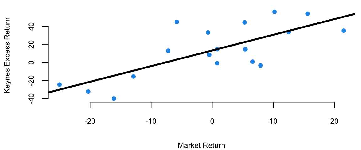
# Extract the model coefficients
coef(model)
(Intercept) Market
13.2 1.7 # summary(model)
model %>% tidy() %>% knitr::kable(digits=2)| term | estimate | std.error | statistic | p.value |
|---|---|---|---|---|
| (Intercept) | 13.2 | 4.75 | 2.8 | 0.01 |
| Market | 1.7 | 0.39 | 4.5 | 0.00 |
The intecept of the least squares line is \(\alpha = 13.2\), which is significantly higher than 0. This indicates that Keynes was able to generate higher returns than the market, even when the market was performing well. This is consistent with his value investing strategy, which allowed him to identify undervalued stocks and generate significant alpha.
Now we adjust of the risk-free returns abc calculate excess return.
Keynes = Keynes - Rate
Market = Market - Rate
modelnew = lm(Keynes~Market)
modelnew %>% tidy() %>% knitr::kable(digits=2)| term | estimate | std.error | statistic | p.value |
|---|---|---|---|---|
| (Intercept) | 14.5 | 4.69 | 3.1 | 0.01 |
| Market | 1.8 | 0.37 | 4.8 | 0.00 |
We see that after the adjustment, the intercept \(\alpha=14.46\) is now even larger.
Regression analysis is the most widely used statistical tool for understanding relationships among variables. It provides a conceptually simple method for investigating functional relationships between one or more factors and an outcome of interest. This relationship is expressed in the form of an equation, which we call the model, connecting the response or dependent variable and one or more explanatory or predictor variable.
It is convenient to introduce a regression model using the language of probability and uncertainty. A regression model assumes that mean of output variable \(y\) depends linearly on predictors \(x_1,\ldots,x_p\) \[ y = \beta_0 + \beta_1 x + \ldots + \beta_p x_p + \epsilon,~ \text{where}~\epsilon \sim N(0, \sigma^2). \] Often, we use simpler dot-product notation \[ y = \beta^Tx + \epsilon, \] where \(\beta = (\beta_0,\beta_1,\ldots,\beta_p)\) is the vector regression coefficients and \(x = (1,x_1,\ldots,x_p)\) is the vector of predictors, with 1 appended to the beginning.
Line coefficients \(\beta_i\)s have the same interpretation as in the deterministic approach. However, the additional term \(\epsilon\) is a random variable that captures the uncertainty in the relationship between \(y\) and \(x\), it is called the error term or the residual. The error term is assumed to be normally distributed with mean zero and variance \(\sigma^2\). Thus, the linear regression model has a new parameter \(\sigma^2\) that models dispersion of \(y_i\) around the mean \(\beta^Tx\), let’s see an example.
Example 11.3 (House Prices) Let’s go back to the Saratoga Houses dataset
d = read.csv("../../data/SaratogaHouses.csv")
d$price = d$price/1000; d$livingArea = d$livingArea/1000
l = lm(price ~ livingArea, data=d)
summary(l)
Call:
lm(formula = price ~ livingArea, data = d)

Residuals:
   Min     1Q Median     3Q    Max
-277.0  -39.4   -7.7   28.4  553.3

Coefficients:
            Estimate Std. Error t value Pr(>|t|)
(Intercept)    13.44       4.99    2.69   0.0072 **
livingArea    113.12       2.68   42.17   <2e-16 ***
---
Signif. codes:  0 '***' 0.001 '**' 0.01 '*' 0.05 '.' 0.1 ' ' 1

Residual standard error: 69 on 1726 degrees of freedom
Multiple R-squared:  0.507, Adjusted R-squared:  0.507
F-statistic: 1.78e+03 on 1 and 1726 DF,  p-value: <2e-16
The output of the lm function has several components. Besides calculating the estimated values of the coefficients, given in the Estimate column, the method also calculates standard error (Std. Error) and t-statistic (t value) for each coefficient. The t-statistic is the ratio of the estimated coefficient to its standard error. The p-value (Pr(>|t|)) is the probability of observing a value at least as extreme as the one observed, assuming the null hypothesis is true. The null hypothesis is that the coefficient is equal to zero. If the p-value is less than 0.05, we typically reject the null hypothesis and conclude that the coefficient is statistically significant. In this case, the p-value for the livingArea coefficient is less than 0.05, so we conclude that the coefficient is statistically significant. This means that the size of the house is a statistically significant predictor of the price. The Residual standard error the standard deviation of the residuals \(\hat y_i - y_i,~i=1,\ldots,n\).
The estimated values of the parameters were calculated using least squares loss function discussed above. The residual standard error is also relatively easy to calculate from the model residuals \[ s_e = \sqrt{ \frac{1}{n-2} \sum_{i=1}^n ( \hat y_i - y_i )^2 }. \] Now the question is, how the p-value for the estimates was calculated? And why did we assume that \(\epsilon\) is normally distributed in the first place? The normality of \(\epsilon\) and as a consequence, the conditional normality of \(y \mid x \overset{iid}{\sim} N(\beta^Tx, \sigma^2)\) is easy to explain, it is simply due to mathematical convenience. Plus, this assumption happen to describe the reality well in a wide range of applications. One of those conveniences, is our ability to estimate to calculate mean and variance of the distribution of \(\hat \beta_0\) and \(\hat \beta_1\).
To understand how to calculate the p-values, we first notice that there is uncertainty about the values of the parameters \(\beta_i\)s. To get a feeling for the amount of variability in our experimentation. Imagine that we have two sample data sets. For example, we have housing data from two different realtor firms. Do you think the estimated value of price per square foot will be the same for both of those? The answer is no. Let’s demonstrate with an example, we simulate 20 data sets from the same distribution and estimate 20 different linear models.
set.seed(92) #Kuzy
d = read.csv("../../data/SaratogaHouses.csv")
d$price = d$price/1000; d$livingArea = d$livingArea/1000
plot(d$livingArea, d$price, pch=20, col="blue", xlab="Living Area", ylab="Price")
for (i in 1:10) {
  # Sample with replacement
  dnew = d[sample(1:nrow(d),replace=T),]
  # Fit a linear model
  l = lm(price ~ livingArea, data=dnew, subset = sample(1:nrow(d),100))
  abline(l, col="green", lwd=3)
}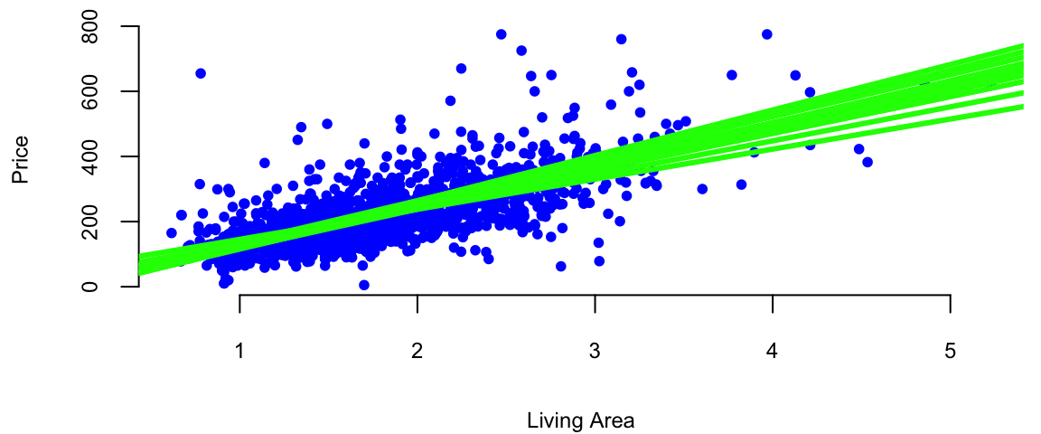
Figure 11.1 shows the results of this simulation. We can see that the estimated coefficients \(\hat \beta_i\) are different for each of the 20 samples. This is due to the sampling error. The sampling error is the difference between the estimated value of a parameter and its true value. The value of \(\beta_1\) will differ from sample to sample. In other words, it will be a random variable. The sampling distribution of \(\beta_1\) describes how it varies over different samples with the \(x\) values fixed. Statistical view of linear regression allows us to calculate confidence and prediction intervals for estimated parameters. It turns out that when least squares principle is used, the estimated \(\hat\beta_1\) is normally distributed: \(\hat\beta_1 \sim N( \beta_1 , s_1^2 )\). Let’s see how we can derive this result.
The extension of the central limit theorem, sometimes called the Lindeberg CLT, states that a linear combination of independent random variables that satisfy some mild condition are approximately normally distributed. We can show that estimates of \((\beta_0\ldots,\beta_p)\) are linear combinations of the observed values of \(y\) and are therefore normally distributed. Indeed, if we write the linear regression model in matrix form \[ Y = X \beta + \epsilon, \] where \(Y\) is the vector of observed values of the dependent variable, \(X\) is the matrix of observed values of the independent variables, \(\beta\) is the vector of unknown parameters, and \(\epsilon\) is the vector of errors. Then, if we take the derivative of the loss function for linear regression and set it to zero, we get the following expression for the estimated parameters \[ \hat \beta = AY, \] where \(A = (X^TX)^{-1}X^T\). Due to Lindeberg central limit theorem, \(\hat \beta\) is normally distributed. This is a useful property that allows us to calculate confidence intervals and p-values for the estimated parameters.
Now, we need to compute the mean and variance of \(\hat \beta\). The mean is easy to compute, since the expectation of the sum is the sum of expectations, we have \[ \hat{\beta} = A(X\beta + \epsilon) \] \[ \hat{\beta} = \beta + A\epsilon \]
The expectation of \(\hat{\beta}\) is: \[ E[\hat{\beta}] = E[\beta + A\epsilon] = E[\beta] + E[A\epsilon] = \beta \] Since \(\beta\) is constant, and \(E[A\epsilon] = 0\) (\(E[\epsilon] = 0\)).
The variance is given by \[ Var(\hat{\beta}) = Var(A\epsilon) \] If we assume that \(\epsilon\) is independent of \(X\), we can write and elements of \(\epsilon\) are uncorrelated, we can write: \[ Var(\hat{\beta}) = AVar(\epsilon)A^T \] Given \(Var(\epsilon) = \sigma^2 I\), we have: \[ Var(\hat{\beta}) = \sigma^2 (X^TX)^{-1} \]
Putting together the expectation and variance, and the fact that we get the following distribution for \(\hat{\beta}\): \[ \hat{\beta} \sim N(\beta, \sigma^2 (X^TX)^{-1}). \]
Statistical approach to linear regression is useful. We can think of the estimated coefficients \(\hat \beta_i\) as an average amount of change in \(y\), when \(x_i\) goes up by one unit. Since this average was calculated using a sample data, it is subject to sampling error and the sampling error is modeled by the normal distribution. Assuming that residuals \(\epsilon\) are independently normally distributed with a variance that does not depend on \(x\) (homoscedasticity), we can calculate the mean and variance of the distribution of \(\hat \beta_i\). This is a useful property that allows us to calculate confidence intervals and p-values for the estimated parameters.
In summary, the statistical view of the linear regression model is useful for understanding the uncertainty associated with the estimated parameters. It also allows us to calculate confidence intervals and prediction intervals for the output variable.
Again, consider a house example. Say in our data we have 10 houses with the same squire footage, say 2000. Now the third point states, that the prices of those houses should follow a normal distribution and if we are to compare prices of 2000 sqft houses and 2500 sqft houses, they will have the same standard deviation. The second point means that price of one house does not depend on the price of another house.
All of the assumptions in the regression model can be written using probabilist notations The looks like: \[ y \mid x \overset{iid}{\sim} N(\beta^Tx, \sigma^2). \]
In the case when we have only one predictor the variance of the estimated slope \(\hat \beta_1\) is given by \[ Var(\hat \beta_1) = \frac{\sigma^2}{\sum_{i=1}^n ( x_i - \bar{x} )^2 } = \frac{ \sigma^2 }{ (n-1) s_x^2 }, \] where \(s_x^2\) is the sample variance of \(x\). Thus, there are three factors that impact the size of standard error for \(\beta_1\): sample size (\(n\)), error variance (\(s^2\)), and \(x\)-spread, \(s_x\).
We can empirically demonstrate the sampling error by simulating several samples from the same distribution and estimating several linear models. We can see that the estimated coefficients \(\hat \beta_i\) are normally distributed around the true values \(\beta_i\). If we plot coefficients for 1000 different models, we can see that the empirical distribution resembles a normal distribution.
set.seed(92) #Kuzy
# Read housing data
d = read.csv("../../data/SaratogaHouses.csv")
d$price = d$price/1000; d$livingArea = d$livingArea/1000
# Simulate 1000 samples
n = 1000
# Create a matrix to store the results
beta = matrix(0, nrow=n, ncol=2)
# Simulate 1000 samples
for (i in 1:n) {
  # Sample with replacement
  dnew = d[sample(1:nrow(d),replace=T),]
  # Fit a linear model
  l = lm(price ~ livingArea, data=dnew)
  # Store the coefficients
  beta[i,] = coef(l)
}
ind = 2
# Plot the results
plot(beta[,1], beta[,2], pch=20, col="blue", xlab="Intercept", ylab="Slope")
abline(h=coef(l)[2], lwd=3, col="red")
abline(v=coef(l)[1], lwd=3, col="red")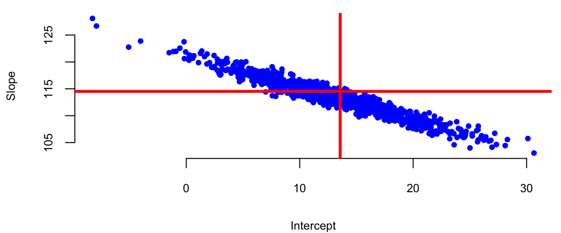
X = cbind(1, d$livingArea)
# Calculate the variance of the coefficients
var = sigma(l)^2 * solve(t(X) %*% X)
varb = var[ind,ind]/0.63
hist(beta[,ind], col="blue", xlab="Intercept", main="",freq=F)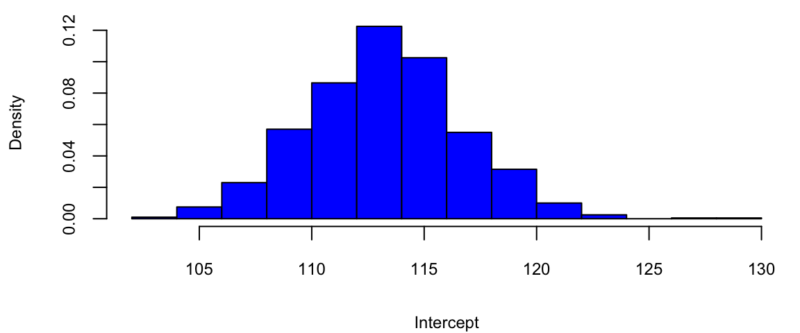
bt = seq(80,140,0.1)Accounting for uncertainty in \(\hat \beta\)s we can calculate confidence intervals for the predicted average \(\hat y\). When we additionally account for the uncertainty in the predicted value \(\hat y\), we can calculate prediction intervals.
Another advantage of adopting a statistical view of the linear regression model is ability to quantify information about potential outliers. Outliers are points that are extreme relative to our model predictions. Recall, that residual is \(e_i = y_i- \hat y_i\). Since our predicted value \(\hat y_i\) follows a normal distribution, the residual also follows a normal distribution, since it is a difference of normal random variable \(\hat y_i\) and a constant \(y_i\). It easy to see that \[e_i \sim N(0, s_e^2),\] where \(s_e^2\) is an empirical estimate of the error’s variance.
Consider the relation between the fitted values \(\hat y_i\) and residuals \(e_i\). Our predictions are given by the line. The residual \(e_i\) and predicted value \(\hat y_i\) for the \(i\)th observation are related via \[y_i = \hat{y}_i + ( y_i - \hat{y}_i ) = \hat{y}_i + e_i\].
Residuals allow us to define outliers. They simply have large residuals. We re-scale the residuals by their standard errors. This lets us define \[r_i = \frac{ e_i }{ s_{ e} } =\frac{y_i - \hat{y}_i }{ s_{ e } }\] Since residuals follow normal distribution \(e \sim N(0,\sigma^2)\), in 95% of the time we expect the standardized residuals to satisfy \(- 2 < r_i < 2\). Any observation with is an extreme outlier, it is three sigmas away from the mean.
Another types of observations we are interested are the influential points. Those are are observations that affect the magnitude of our estimates \(\hat{\beta}\)’s. They are important to find as they typically have economic consequences. We will use to assess the significance of an influential point. Cook’s distance associated with sample \(i\) measure the change in estimated model parameters \(\hat \beta\) when sample \(i\) is removed from the training data set.
Intuitively, we model regression-back-to-the-mean effect. This is one of the most interesting statistical effects you’ll see in daily life. In statistics, regression does not mean “going backwards”, but rather the tendency for a variable that is extremely high or low to move closer to the average upon subsequent measurement. For example, Francis Galton, who was a cousin of Charles Darwin, in his study on regression to the mean height showed that if your parents are taller than the average, you’ll regress back to the average. While people might expect the children of tall parents to be even taller and the children of short parents to be even shorter, Galton found that this wasn’t the case. Instead, he observed that the heights of the children tended to be closer to the average height for the population. Galton termed this phenomenon “regression towards mediocrity” (now more commonly known as “regression to the mean”). It meant that extreme characteristics (in this case, height) in parents were likely to be less extreme (closer to the average) in their children. It is a classic example that helped introduce and explain this statistical concept. Galton’s finding was one of the first insights into what is now a well-known statistical phenomenon. It doesn’t imply that all individual cases will follow this pattern; rather, it’s a trend observed across a population. It’s important to understand that regression to the mean doesn’t suggest that extreme traits diminish over generations but rather that an extreme measurement is partly due to random variation and is likely to be less extreme upon subsequent measurement.
Another example was documented by Daniel Kahneman and Amos Tversky in their book Thinking, Fast and Slow. They found that when a person performs a task, their performance is partly due to skill and partly due to luck. They observed that when a person performs a task and achieves an extreme result, their subsequent performance is likely to be less extreme. Particularly they studied effect of criticism and praise used by Israeli Air Force fighter pilots trainers. After criticism, the low-scoring pilots were retested. Often, their scores improve. At first glance, this seems like a clear effect of feedback from the trainer. However, some of this improvement is likely a statistical artifact and demonstrates the regression to the mean effect.
Why? Those pilots who initially scored poorly were, statistically speaking, somewhat unlucky. Their low scores may have been due to a bad day, stress, or other factors. When retested, their scores are likely to be closer to their true skill level, which is closer to the average. This natural movement towards the average can give the illusion that the intervention (praise or criticism) was more effective than it actually was. Conversely, if the top performers were praised and retested, we might find their scores decrease slightly, not necessarily due to the inefficacy of the praise but due to their initial high scores being partly due to good luck or an exceptionally good day. In conclusion, in pilot training and other fields, it’s important to consider regression to the mean when evaluating the effectiveness of interventions. Without this consideration, one might draw incorrect conclusions about the impact of training or other changes.
Example 11.4 (Google vs S&P 500) We will demonstrate how we can use statistical properties of a linear regression model to understand the relationship between returns of a google stock and the S&P 500 index. We will use Capital Asset Pricing Model (CAPM) regression model to estimate the expected return of an investment into Google stock and to price the risk. The CAPM model is
\[ \mathrm{GOOG} = \alpha + \beta \mathrm{SP500} + \epsilon \] On the left hand side, we have the return that investors expect to earn from investing into Google stock. In the CAPM model, this return is typically modeled as a dependent variable.
The input variable SP500 represents the average return of the entire US market. Beta measures the volatility or systematic risk of a security or a portfolio in comparison to the market as a whole. A beta greater than 1 indicates that the security is more volatile than the market, while a beta less than 1 indicates it is less volatile. Alpha is the intercept of the regression line, it measures the excess return of the security over the market. The error term \(\epsilon\) captures the uncertainty in the relationship between the returns of Google stock and the market.
In a CAPM regression analysis, the goal is to find out how well the model explains the returns of a security based on its beta. This involves regressing the security’s excess returns (returns over the risk-free rate) against the excess returns of the market. The slope of the regression line represents the beta, and the intercept should ideally be close to the risk-free rate, although in practice it often deviates. This model helps in understanding the relationship between the expected return and the systematic risk of an investment.
Based on the uncertainty associated with the estimates for alpha and beta, we can formulate some of hypothesis tests, for example
getSymbols(Symbols = c("GOOG","SPY"),from='2017-01-03',to='2023-12-29') "GOOG" "SPY" gret = as.numeric(dailyReturn(GOOG))
spyret = as.numeric(dailyReturn(SPY))
l = lm(gret ~ spyret)
tidy(l) %>% knitr::kable(digits=4)| term | estimate | std.error | statistic | p.value |
|---|---|---|---|---|
| (Intercept) | 0.0003 | 0.0003 | 1.1 | 0.27 |
| spyret | 1.1706 | 0.0240 | 48.8 | 0.00 |
Google vs S&P 500 returns between 2017-2023
plot(gret, spyret, pch=20, col="blue", xlab="Google Return", ylab="SPY Return")
abline(l, lwd=3, col="red")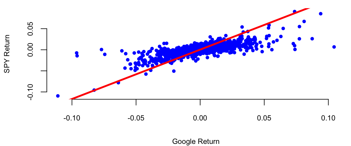
Here’s what we get after we fit the model using function
Our best estimates are \[ \hat \alpha = 0.0004 \; , \; \hat{\beta} = 1.01 \]
Now we can provide the results for hypothesis we set at he beginning. Given that the p-value for \(H_0: \beta = 0\) is <2e-16 we can reject the null hypothesis and conclude that Google is related to the market. The p-value for \(H_0: \alpha = 0\) is 0.06, which is grater than 0.05, so we cannot reject the null hypothesis and conclude that Google does not out-performs the market in a consistent fashion in the 2017-2023 period.
Further, we can answer some of the other important questions, such as how much will Google move if the market goes up \(10\)%?
alpha = coef(l)[1]
beta = coef(l)[2]
# Calculate the expected return
alpha + beta*0.1
(Intercept)
0.12 However, if we look at the earlier period between 2005-2016 (the earlier days of Google) the results will be different.
getSymbols(Symbols = c("GOOG","SPY"),from='2005-01-03',to='2016-12-29'); "GOOG" "SPY" gret = as.numeric(dailyReturn(GOOG))
spyret = as.numeric(dailyReturn(SPY))
l = lm(gret ~ spyret)
tidy(l) %>% knitr::kable(digits=4)| term | estimate | std.error | statistic | p.value |
|---|---|---|---|---|
| (Intercept) | 0.0006 | 0.0003 | 2.2 | 0.03 |
| spyret | 0.9231 | 0.0230 | 40.1 | 0.00 |
plot(gret, spyret, pch=20, col="blue", xlab="Google Return", ylab="SPY Return")
abline(l, lwd=3, col="red")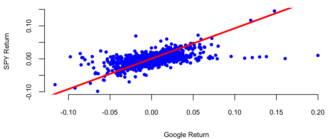
In this period Google did consistently outperform the market. The p-value for \(H_0: \alpha = 0\) is 0.03.
A linear model assumes that output variable is proportional to the input variable plus an offset. However, this is not always the case. Often, we need to transform input variables by combining multiple inputs into a single predictor, for example by taking a ratio or putting inputs on a different scale, e.g. log-scale. In machine learning, this process is called feature engineering.
One of the classic examples of feature engineering is Fama-French three-factor model which is used in asset pricing and portfolio management. The model states that asset returns depend on (1) market risk, (2) the outperforming of small versus big companies, and (3) the outperformance of high book/market versus small book/market companies, mathematically \[r = R_f + \beta(R_m - R_f) + b_s\cdot SMB + b_v\cdot HML + \alpha\] Here \(R_f\) is risk-free return, \(R_m\) is the return of market, \(SMB\) stands for "Small market capitalization Minus Big" and \(HML\) for "High book-to-market ratio Minus Low"; they measure the historic excess returns of small caps over big caps and of value stocks over growth stocks. These factors are calculated with combinations of portfolios composed by ranked stocks (BtM ranking, Cap ranking) and available historical market data.
Consider, the growth of the Apple stock between 2000 and 2024. With the exception of the 2008 financial crisis period and 2020 COVID 19 related declines, the stock price has been growing exponentially. Figure 11.3 shows the price of the Apple stock between 2000 and 2024. The price is closely related to the company’s growth.
getSymbols(Symbols = "AAPL",from='2000-01-01',to='2023-12-31'); "AAPL"plot(AAPL$AAPL.Adjusted, type='l', col="blue", xlab="Date", ylab="Price")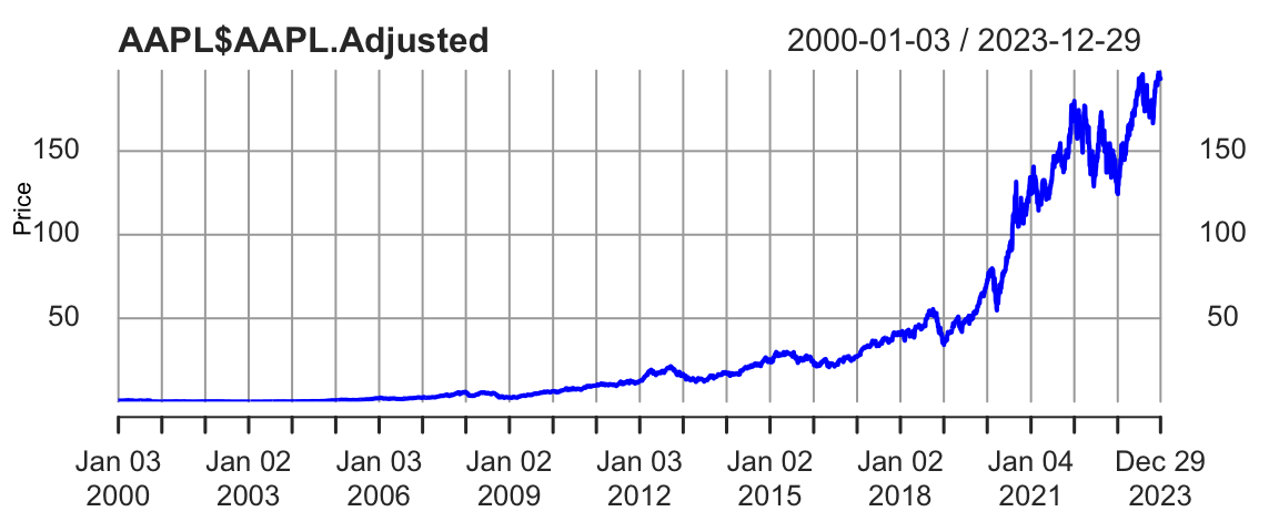
The 2008 and 2020 declines are more related to extraneous factors, rather than the growth of the company. Thus, we can conclude that the overall growth of the company is exponential. Indeed, if we try to fit a linear model to the time-price data, we will see that the model does not fit the data well
time = index(AAPL) - start(AAPL)
plot(time,AAPL$AAPL.Adjusted, type='l', col="blue", xlab="Date", ylab="Price")
abline(lm(AAPL$AAPL.Adjusted ~ time), col="red", lwd=3)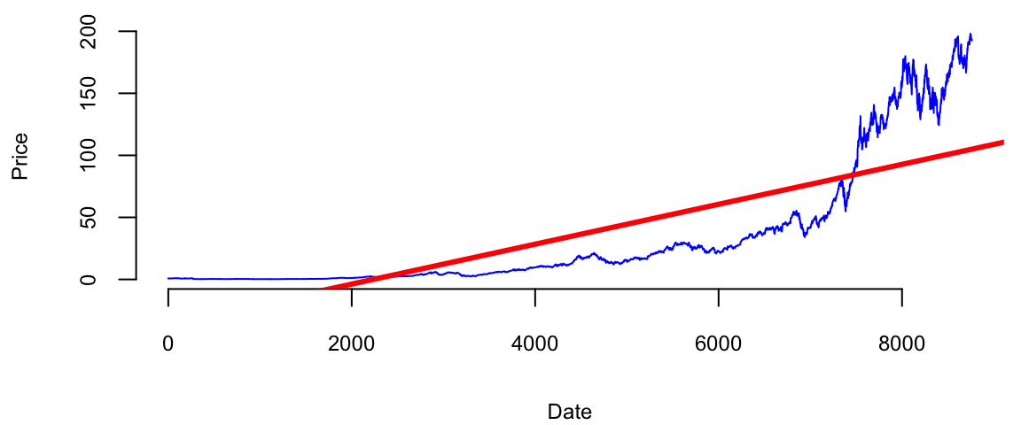
Just by visual inspection we can see that a straight line will not be a good fit for this data. The growth of a successful company typically follows the rule of compounding. Compounding is a fundamental principle that describes how some quantity grows over time when this quantity increases by a fixed percentage periodically. This is a very common phenomenon in nature and business. For example, if two parents have 2.2 children on average, then the population increases by 10% every generation. Another example is growth of investment in a savings account.
A more intuitive example is probably an investment in a savings account. If you invest \(1000\) in a savings account with \(10\%\) annual interest rate and you get payed once a year, then your account value will be \(1100\) by the end of the year. However, if you get get payed \(n\) times a year, and initially invest \(y_0\) final value \(y\) of the account after \(t\) years will be \[ y = y_0 \times (1 + r/n)^{nt} \] where \(r\) is the annual interest rate. When you get payed every month (\(n=12\)), a traditional payout schedule used by banks, then \[ y = 1000 \times (1 + 0.1/12)^{12} = 1105. \] A value slightly higher than the annual payout of 1100.
The effect of compounding is minimal in the short term. However, the effect of compounding is more pronounced when the growth rate is higher and time periods are longer. For example at \(r=2\), \(n=365\) and 4-year period \(t=4\), you get \[ y = 1000 \times (1 + 2/365)^{3\times 365} = 2,916,565. \] Your account is close to 3 million dollars! Compared to \(n=1\) scenario \[ y = 1000 \times (1 + 2)^{4} = 81,000, \] when you will end up with mealy 81 thousand. This is why compounding is often referred to as the “eighth wonder of the world” in investing contexts, emphasizing its power in growing wealth over time.
In general, as \(n\) goes up, the growth rate of the quantity approaches the constant
n = 1:300
r = 1
plot(n, (1+r/n)^n, type='l', col="blue", xlab="n", ylab="Future Value")
abline(h=exp(r), col="red", lwd=3)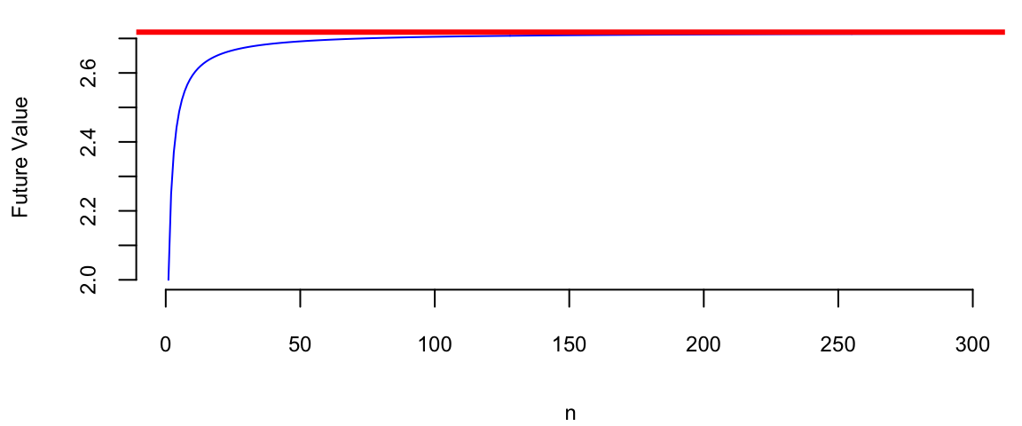
Figure 11.4 shows the growth of an investment in a savings account when \(n\) increases and return rate is \(100\%\) per year. We can see that the growth rate approaches the constant \(e \approx 2.72\) as \(n\) increases. \[ (1+r/n)^n \rightarrow e^r,~\text{as}~n \rightarrow \infty. \] This limit was first delivered by Leonhard Euler and the number \(e\) is known as Euler’s number.
Coming back to the growth of the Apple company, we can think of it growing at small constant rate every day. The relation between the time and size of Apple is multiplicative. Meaning when when time increases by one day, the size of the company increases by a small constant percentage. This is a multiplicative relation. In contrast, linear relation is additive, meaning that when time increases by one day, the size of the company increases by a constant amount. The exponential growth model is given by the formula \[ y = y_0 \times e^{\beta^Tx}. \] There are many business and natural science examples where multiplicative relation holds. IF we apply the \(\log\) function to both sides of the equation, we get \[ \log y = \log y_0 + \beta^Tx. \] This is a linear relation between \(\log y\) and \(x\). Thus, we can use linear regression to estimate the parameters of the exponential growth model by putting the output variable \(y\) on the log-scale.
Another example of nonlinear relation that can be analyzed using linear regression is when variables are related via a power law. This concept helps us modeling proportional relationships or ratios. In a multiplicative relationship, when one variable changes on a percent scale, the other changes in a directly proportional manner, as long as the multiplying factor remains constant. For example, the relation between the size of a city and the number of cars registered in the city is given by a power law. When the size of the city doubles, the number of cars registered in the city is also expected to double. The power law model is given by the formula \[ y = \beta_0 x^{\beta_1}. \] If we apply the \(\log\) function to both sides of the equation, we get \[ \log y = \log \beta_0 + \beta_1 \log x. \] This is a linear relation between \(\log y\) and \(\log x\). Thus, we can use linear regression to estimate the parameters of the power law model by putting the output variable \(y\) and input variable \(x\) on the log-scale.
However, there are several caveats when putting variables on the log-scale. We need to make sure that the variable is positive. It means that we cannot apply log transformations to dummy or count variables.
Example 11.5 (World’s Smartest Mammal) We will demonstrate the power relation using the data on the brain (measured in grams) and body (measured in kilograms) weights for 62 mammal species. The data was collected by Harry J. Jerison in 1973. The data set contains the following variables:
mammals = read.csv("../../data/mammals.csv")
knitr::kable(head(mammals))| Mammal | Brain | Body |
|---|---|---|
| African_elephant | 5712.0 | 6654.00 |
| African_giant_pouched_rat | 6.6 | 1.00 |
| Arctic_Fox | 44.5 | 3.38 |
| Arctic_ground_squirrel | 5.7 | 0.92 |
| Asian_elephant | 4603.0 | 2547.00 |
| Baboon | 179.5 | 10.55 |
Let’s build a linear model.
attach(mammals)
model = lm(Brain~Body)
plot(Body,Brain, pch=21, bg="lightblue")
abline(model, col="red", lwd=3)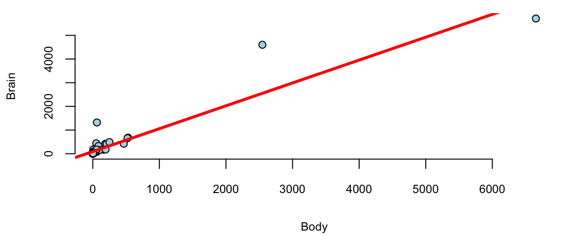
We see a few outliers with suggests that normality assumption is violated. We can check the residuals by plotting residuals against fitted values and plotting fitted vs true values.
plot(model$fitted.values, model$residuals, pch=21, bg="lightblue", xlab="Fitted y", ylab="Residuals")
abline(h=0, col="red", lwd=3)
plot(Brain, model$fitted.values, pch=21, bg="lightblue", xlab="True y", ylab="Fitted y")
abline(a=0,b=1, col="red", lwd=3)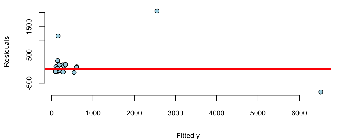
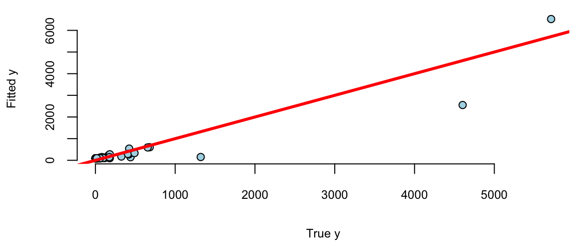
Remember, that residuals should roughly follow a normal distribution with mean zero and constant variance. We can see that the residuals are not normally distributed and the variance increases with the fitted values. This is a clear indication that we need to transform the data. We can try a log-log transformation.
model = lm(log(Brain)~log(Body))
model %>% tidy() %>% knitr::kable(digits=2)| term | estimate | std.error | statistic | p.value |
|---|---|---|---|---|
| (Intercept) | 2.18 | 0.11 | 20 | 0 |
| log(Body) | 0.74 | 0.03 | 23 | 0 |
plot(model$fitted.values, model$residuals, pch=21, bg="lightblue")
abline(h=0, col="red", lwd=3)
plot(log(Brain), model$fitted.values, pch=21, bg="lightblue")
abline(a=0,b=1, col="red", lwd=3)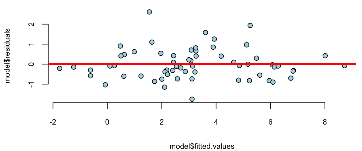
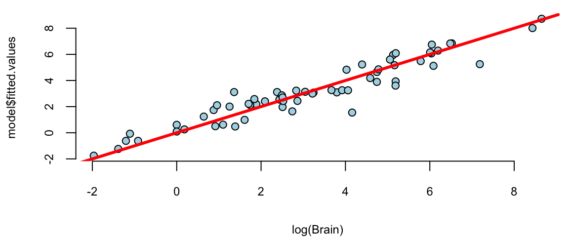
That is much better! The residuals variance is constant and the plot of fitted vs true values shows a linear relationship. The log-log model is given by the formula \[ \log \mathrm{Brain} = 2.18 + 0.74 \log \mathrm{Body}. \] seem to achieve two important goals, namely linearity and constant variance. The coefficients are highly significant.
Although the log-log model fits the data rather well, there are a couple of outliers there. Let us print the observations with the largest residuals.
# res = rstudent(model)
res = model$residuals/sd(model$residuals)
outliers = order(res,decreasing = T)[1:10]
cbind(mammals[outliers,],
      Std.Res = res[outliers], Residual=model$residuals[outliers],
Fit = exp(model$fitted.values[outliers])) %>% knitr::kable(digits=2)| Mammal | Brain | Body | Std.Res | Residual | Fit | |
|---|---|---|---|---|---|---|
| 11 | Chinchilla | 64 | 0.42 | 3.41 | 2.61 | 4.7 |
| 34 | Man | 1320 | 62.00 | 2.53 | 1.93 | 190.7 |
| 50 | Rhesus_monkey | 179 | 6.80 | 2.06 | 1.58 | 36.9 |
| 6 | Baboon | 180 | 10.55 | 1.64 | 1.26 | 51.1 |
| 42 | Owl_monkey | 16 | 0.48 | 1.44 | 1.10 | 5.1 |
| 10 | Chimpanzee | 440 | 52.16 | 1.26 | 0.96 | 167.7 |
| 27 | Ground_squirrel | 4 | 0.10 | 1.18 | 0.91 | 1.6 |
| 43 | Patas_monkey | 115 | 10.00 | 1.11 | 0.85 | 49.1 |
| 60 | Vervet | 58 | 4.19 | 1.06 | 0.81 | 25.7 |
| 3 | Arctic_Fox | 44 | 3.38 | 0.92 | 0.71 | 22.0 |
There are two outliers, the Chinchilla and the Human, both have disproportionately large brains!
In fact, the Chinchilla has the largest standartised residual of 3.41. Meaning that predicted value of 4.7 g is 3.41 standard diviaitons away from the recorded value of 64 g. This suggests that the Chinchilla is a master race of supreme intelligence! However, afer checking more carefully we realized that there was a recording error and the acual weight of an average Chinchilla’s brain is 6.4. We mistyped the decimal separator! Thus the actual residual is 0.4.
abs(model$fitted.values[11] - log(6.4))/sd(model$residuals) 11
0.4 In reality Chinchilla’s brain is not far from an average mamal of this size!
In many situations, \(X_1\) and \(X_2\) interact when predicting \(Y\). An interaction occurs when the effect of one independent variable on the dependent variable changes at different levels of another independent variable. For example, consider a study analyzing the effect of study hours \(X_1\) and a tutoring program \(X_2\), a binary variable where 0 = no tutoring, 1 = tutoring) on test scores \(Y\). Without an interaction term, we assume the effect of study hours on test scores is the same regardless of tutoring. With an interaction term, we can explore whether the effect of study hours on test scores is different for those who receive tutoring compared to those who do not. Here are a few more examples when there is potential interraction.
If we think that the effect of \(X_1\) on \(Y\) depends on the value of \(X_2\), we model it using a liner relation \[ \beta_1 = \beta_{10} + \beta_{11} X_2 \] and the model without interaction \(Y = \beta_0 + \beta_1 X_1 + \beta_2 X_2\) becomes \[ Y = \beta_0 + \beta_1 X_1 + \beta_2 X_2 + \beta_3 X_1 X_2 + \epsilon. \] The interaction term captures the effect of \(X_1\) on \(Y\) when \(X_2=1\). The coefficient \(\beta_3\) is the difference in the effect of \(X_1\) on \(Y\) when \(X_2=1\) and \(X_2=0\). If \(\beta_3\) is significant, then there is an interaction effect. If \(\beta_3\) is not significant, then there is no interaction effect.
In R:
model = lm(y = x1 * x2)gives \(X_1+X_2+X_1X_2\), and
model = lm(y = x1:x2)gives only \(X_1 X_2\)
The coefficients \(\beta_1\) and \(\beta_2\) are marginal effects.
If \(\beta_3\) is significant there’s an interaction effect and ee leave \(\beta_1\) and \(\beta_2\) in the model whether they are significant or not.
\(X_1\) and \(D\) dummy
Example 11.6 (Orange Juice)
oj = read.csv("./../../data/oj.csv")
knitr::kable(oj[1:5,1:10], digits=2)| store | brand | week | logmove | feat | price | AGE60 | EDUC | ETHNIC | INCOME |
|---|---|---|---|---|---|---|---|---|---|
| 2 | tropicana | 40 | 9.0 | 0 | 3.9 | 0.23 | 0.25 | 0.11 | 11 |
| 2 | tropicana | 46 | 8.7 | 0 | 3.9 | 0.23 | 0.25 | 0.11 | 11 |
| 2 | tropicana | 47 | 8.2 | 0 | 3.9 | 0.23 | 0.25 | 0.11 | 11 |
| 2 | tropicana | 48 | 9.0 | 0 | 3.9 | 0.23 | 0.25 | 0.11 | 11 |
| 2 | tropicana | 50 | 9.1 | 0 | 3.9 | 0.23 | 0.25 | 0.11 | 11 |
model = lm(logmove ~ log(price)*feat, data=oj)
model %>% tidy() %>% knitr::kable(digits=2)| term | estimate | std.error | statistic | p.value |
|---|---|---|---|---|
| (Intercept) | 9.66 | 0.02 | 588 | 0 |
| log(price) | -0.96 | 0.02 | -51 | 0 |
| feat | 1.71 | 0.03 | 56 | 0 |
| log(price):feat | -0.98 | 0.04 | -23 | 0 |
model = lm(log(price)~ brand-1, data = oj)
model %>% tidy() %>% knitr::kable(digits=2)| term | estimate | std.error | statistic | p.value |
|---|---|---|---|---|
| branddominicks | 0.53 | 0 | 254 | 0 |
| brandminute.maid | 0.79 | 0 | 382 | 0 |
| brandtropicana | 1.03 | 0 | 500 | 0 |
brandcol <- c("green","red","gold")
oj$brand = factor(oj$brand)
boxplot(log(price) ~ brand, data=oj, col=brandcol)
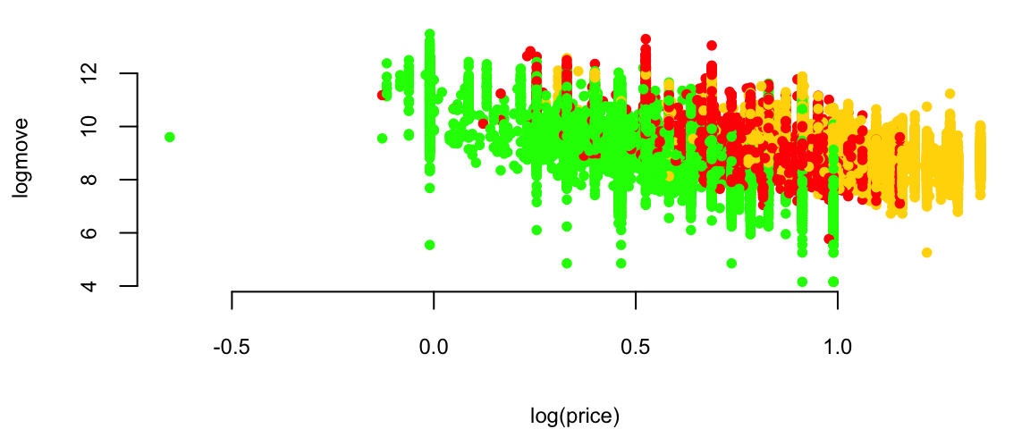
plot(logmove ~ log(price), data=oj, col=brandcol[oj$brand], pch=20)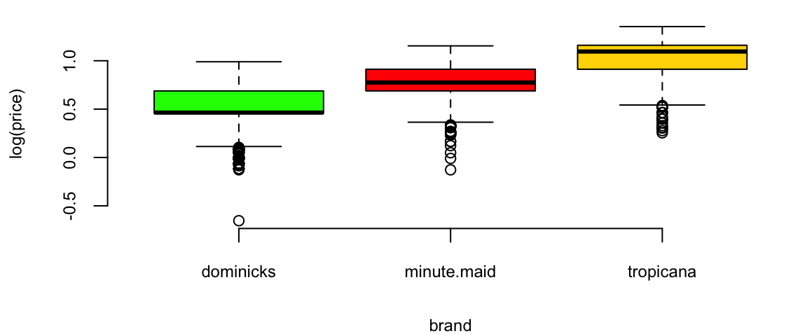
Orange Juice: Price vs Sales
plot(exp(logmove) ~ price, data=oj, col=brandcol[oj$brand], pch=16, cex=0.5, ylab="move")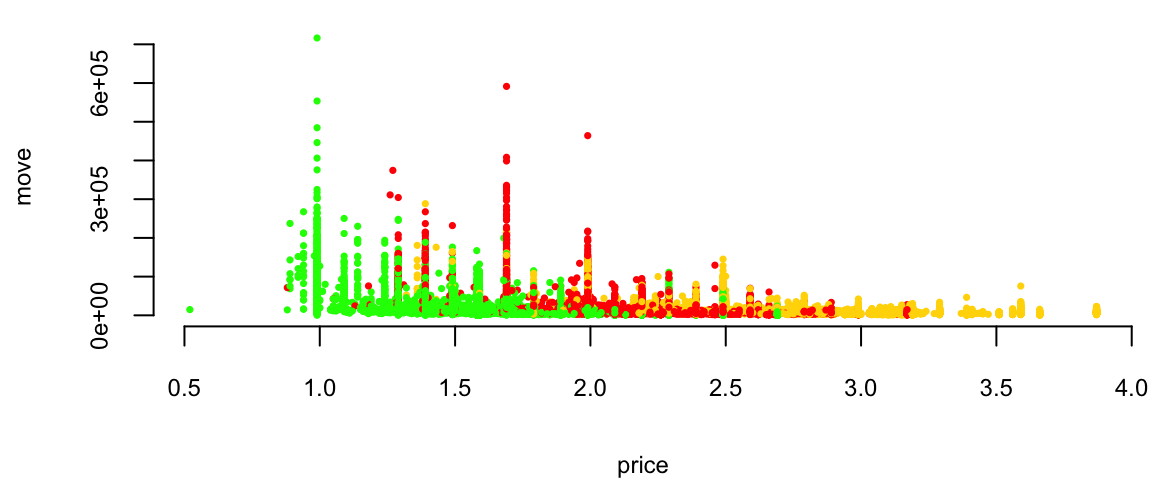
Orange Juice: Price vs log(Sales)
plot(logmove ~ price, data=oj, col=brandcol[oj$brand], pch=16, cex=0.5, ylab="log(move)")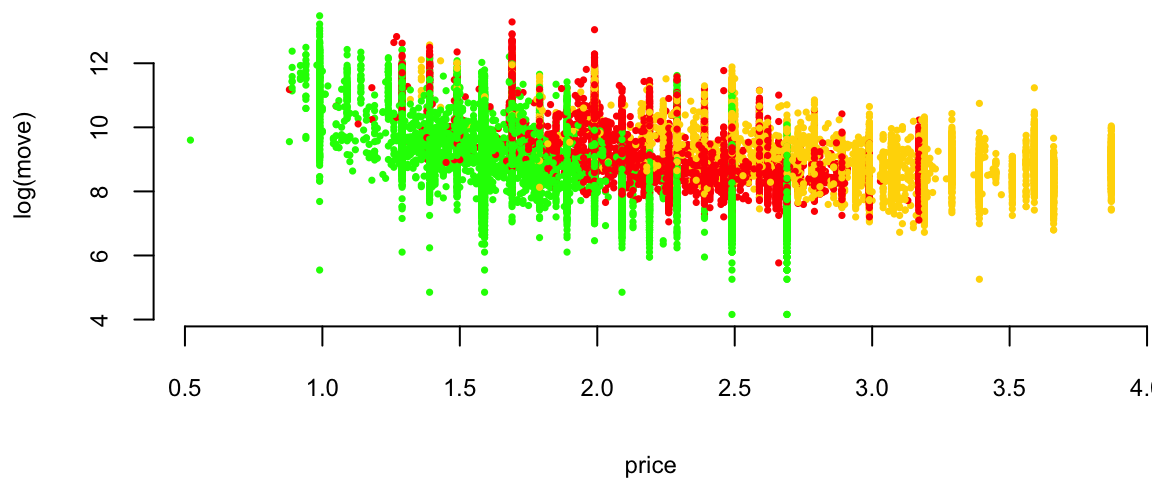
Orange Juice: Price vs log(Sales)
l1 <- loess(logmove ~ price, data=oj, span=2)
smoothed1 <- predict(l1)
ind = order(oj$price)
plot(logmove ~ price, data=oj, col=brandcol[oj$brand], pch=16, cex=0.5, ylab="log(move)")
lines(smoothed1[ind], x=oj$price[ind], col="blue", lwd=2)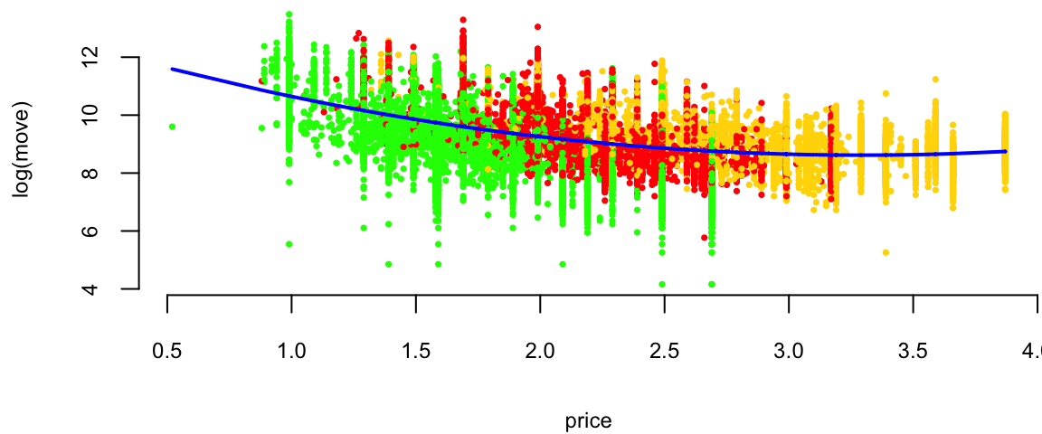
Orange Juice: log(Price) vs log(Sales)
plot(logmove ~ log(price), data=oj, col=brandcol[oj$brand], pch=16, cex=0.5, ylab="log(move)")
l2 <- lm(logmove ~ log(price), data=oj)
smoothed2 <- predict(l2)
ind = order(oj$price)
lines(smoothed2[ind], x=log(oj$price[ind]), col="blue", lwd=2)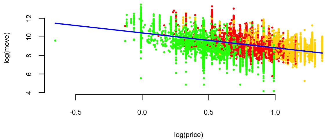
Why? Multiplicative (rather than additive) change.
Now we are interested in how does advertisement affect price sensitivity?
Original model \[ \log(\mathrm{sales}) = \beta_0 + \beta_1\log(\mathrm{price}) + \beta_2 \mathrm{feat}. \] If we feature the brand (in-store display promo or flyer ad), does it affect price sensitivity \(\beta_1\)? If we assume it does \[ \beta_1 = \beta_3 + \beta_4\mathrm{feat}. \] The new model is \[ \log(\mathrm{sales}) = \beta_0 + (\beta_3 + \beta_4\mathrm{feat})\log(\mathrm{price}) + \beta_2 \mathrm{feat}. \] After expanding \[ \log(\mathrm{sales}) = \beta_0 + \beta_3\log(\mathrm{price}) + \beta_4\mathrm{feat}*\log(\mathrm{price}) + \beta_2 \mathrm{feat}. \]
## and finally, consider 3-way interactions
ojreg <- lm(logmove ~ log(price)*feat, data=oj)
ojreg %>% tidy() %>% knitr::kable(digits=2)| term | estimate | std.error | statistic | p.value |
|---|---|---|---|---|
| (Intercept) | 9.66 | 0.02 | 588 | 0 |
| log(price) | -0.96 | 0.02 | -51 | 0 |
| feat | 1.71 | 0.03 | 56 | 0 |
| log(price):feat | -0.98 | 0.04 | -23 | 0 |
lm(logmove ~ log(price), data=oj) %>% tidy() %>% knitr::kable(digits=2)| term | estimate | std.error | statistic | p.value |
|---|---|---|---|---|
| (Intercept) | 10.4 | 0.02 | 679 | 0 |
| log(price) | -1.6 | 0.02 | -87 | 0 |
lm(logmove ~ log(price)+feat + brand, data=oj) %>% tidy() %>% knitr::kable(digits=2)| term | estimate | std.error | statistic | p.value |
|---|---|---|---|---|
| (Intercept) | 10.28 | 0.01 | 708 | 0 |
| log(price) | -2.53 | 0.02 | -116 | 0 |
| feat | 0.89 | 0.01 | 85 | 0 |
| brandminute.maid | 0.68 | 0.01 | 58 | 0 |
| brandtropicana | 1.30 | 0.01 | 88 | 0 |
lm(logmove ~ log(price)*feat, data=oj) %>% tidy() %>% knitr::kable(digits=2)| term | estimate | std.error | statistic | p.value |
|---|---|---|---|---|
| (Intercept) | 9.66 | 0.02 | 588 | 0 |
| log(price) | -0.96 | 0.02 | -51 | 0 |
| feat | 1.71 | 0.03 | 56 | 0 |
| log(price):feat | -0.98 | 0.04 | -23 | 0 |
lm(logmove ~ brand-1, data=oj) %>% tidy() %>% knitr::kable(digits=2)| term | estimate | std.error | statistic | p.value |
|---|---|---|---|---|
| branddominicks | 9.2 | 0.01 | 885 | 0 |
| brandminute.maid | 9.2 | 0.01 | 889 | 0 |
| brandtropicana | 9.1 | 0.01 | 879 | 0 |
Advertisement increases price sensitivity from -0.96 to -0.958 - 0.98 = -1.94!
Why?
One of the reasons is that the price was lowered during the Ad campaign!
doj = oj %>% filter(brand=="dominicks")
par(mfrow=c(1,3), mar=c(4.2,4.6,2,1))
boxplot(price ~  feat, data = oj[oj$brand=="dominicks",], col=c(2,3), main="dominicks", ylab="Price ($)")
boxplot(price ~  feat, data = oj[oj$brand=="minute.maid",], col=c(2,3), main="minute.maid")
boxplot(price ~  feat, data = oj[oj$brand=="tropicana",], col=c(2,3), main="tropicana")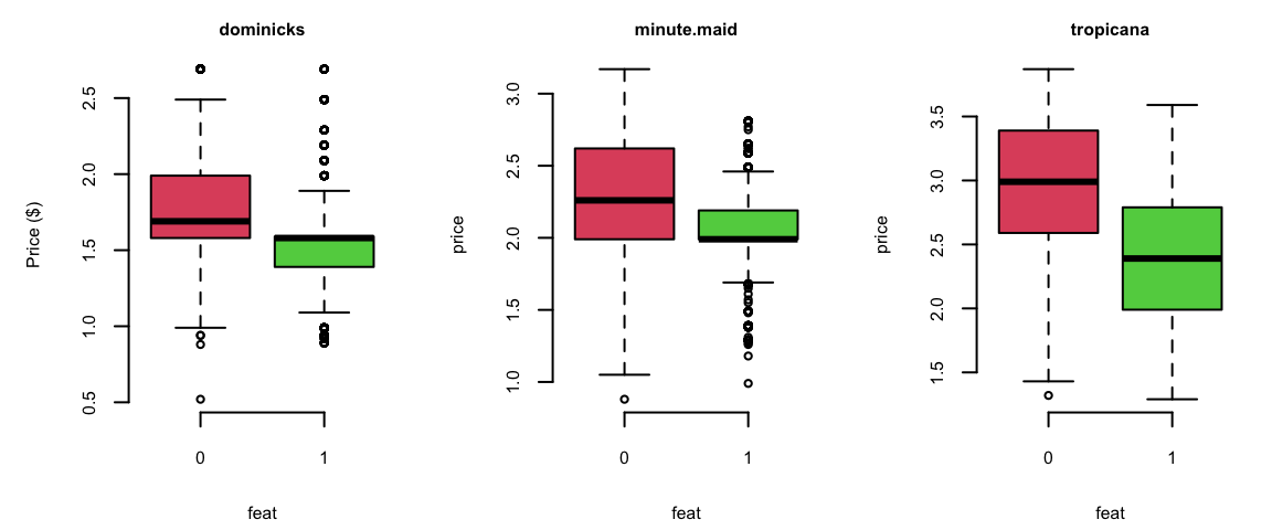
0 = not featured, 1 = featured
We want to understand effect of the brand on the sales \[\log(\mathrm{sales}) = \beta_0 + \beta_1\log(\mathrm{price}) + \xcancel{\beta_2\mathrm{brand}}\]
But brand is not a number!
How can you use it in your regression equation?
We introduce dummy variables
| Brand | Intercept | brandminute.maid | brandtropicana |
|---|---|---|---|
| minute.maid | 1 | 1 | 0 |
| tropicana | 1 | 0 | 1 |
| dominicks | 1 | 0 | 0 |
\[\log(\mathrm{sales}) = \beta_0 + \beta_1\log(\mathrm{price}) + \beta_{21}\mathrm{brandminute.maid} + \beta_{22}\mathrm{brandtropicana}\]
R will automatically do it it for you
print(lm(logmove ~ log(price)+brand, data=oj))
Call:
lm(formula = logmove ~ log(price) + brand, data = oj)

Coefficients:
     (Intercept)        log(price)  brandminute.maid    brandtropicana
           10.83             -3.14              0.87              1.53
\[\log(\mathrm{sales}) = \beta_0 + \beta_1\log(\mathrm{price}) + \beta_3\mathrm{brandminute.maid} + \beta_4\mathrm{brandtropicana}\]
\(\beta_3\) and \(\beta_4\) are “change relative to reference" (dominicks here).
How does brand affect price sensitivity?
Interactions: logmove ~ log(price) * brand
No Interactions: logmove ~ log(price) + brand
| Parameter | Interactions | No Interactions |
|---|---|---|
| (Intercept) | 10.95 | 10.8288 |
| log(price) | -3.37 | -3.1387 |
| brandminute.maid | 0.89 | 0.8702 |
| brandtropicana | 0.96239 | 1.5299 |
| log(price):brandminute.maid | 0.057 | |
| log(price):brandtropicana | 0.67 |
Example 11.7 (Golf Performance Data) Dave Pelz has written two best-selling books for golfers, Dave Pelz’s Short Game Bible, and Dave Pelz’s Putting Bible.
Dave Pelz was formerly a “rocket scientist” (literally) Data analytics helped him refine his analysis It’s the short-game that matters!
The optimal speed for a putt Best chance to make the putt is one that will leave the ball \(17\) inches past the hole, if it misses.
Golf Data
Year-end performance data on 195 players from the 2000 PGA Tour.
nevents, the number of official PGA events included in the statistics
money, the official dollar winnings of the player
drivedist, the average number of yards driven on par 4 and par 5 holes
gir, greens in regulation, measured as the percentage of time that the first (tee) shot on a par 3 hole ends up on the green, or the second shot on a par 4 hole ends up on the green, or the third shot on a par 5 hole ends up on the green
avgputts, which is the average number of putts per round.
Analyze these data to see which of nevents, rivedist, gir, avgputts is most important for winning money.
Regression of Money on all explanatory variables:
d00 = read_csv("../../data/pga-2000.csv")
d18 = read_csv("../../data/pga-2018.csv")model18 = lm(money ~ nevents + drivedist + gir + avgputts, data=d18)
model00 = lm(money ~ nevents + drivedist + gir + avgputts, data=d00)
model00 %>% tidy() %>% knitr::kable(digits=2)| term | estimate | std.error | statistic | p.value |
|---|---|---|---|---|
| (Intercept) | 1.5e+07 | 4206466 | 3.5 | 0.00 |
| nevents | -3.0e+04 | 11183 | -2.7 | 0.01 |
| drivedist | 2.1e+04 | 6913 | 3.1 | 0.00 |
| gir | 1.2e+05 | 17429 | 6.9 | 0.00 |
| avgputts | -1.5e+07 | 2000905 | -7.6 | 0.00 |
\(R^2 = 50\)%
Residuals
hist(rstandard(model00), breaks=20, col="lightblue", xlab = "Standartized Residual", main="")
arrows(x0 = 7.5,y0 = 20,x1 = 8.5,y1 = 2,length = 0.1)
text(x = 7,y = 22,labels = "Tiger Woods", cex=1.5)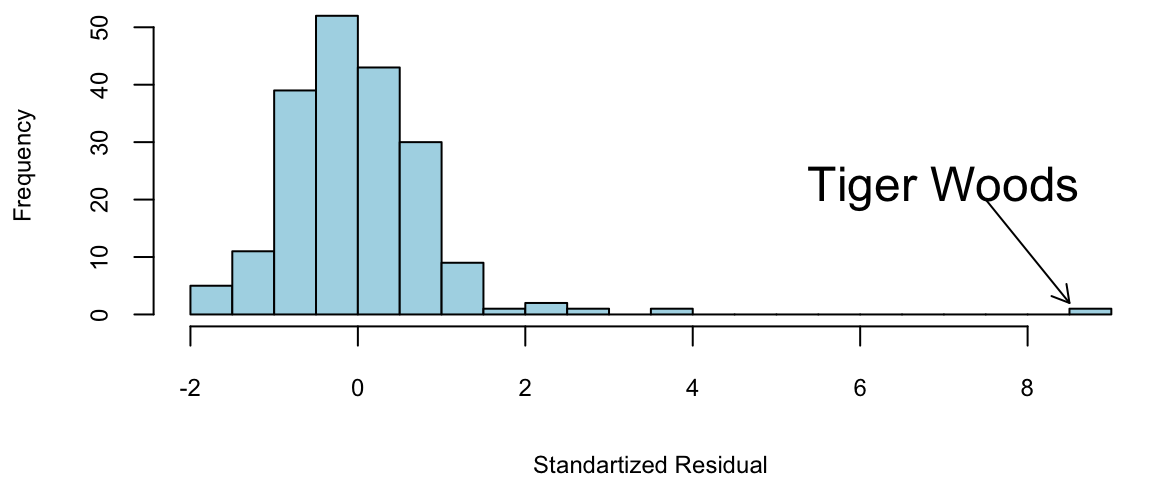
Regression
Transform with log(Money) as it has much better residual diagnostic plots.
m = lm(formula = log(money) ~ nevents + drivedist + gir + avgputts, data = d00)
summary(m)
Call:
lm(formula = log(money) ~ nevents + drivedist + gir + avgputts,
    data = d00)

Residuals:
    Min      1Q  Median      3Q     Max
-1.5438 -0.3655 -0.0058  0.3968  1.9262

Coefficients:
             Estimate Std. Error t value Pr(>|t|)
(Intercept)  36.14923    3.57763   10.10   <2e-16 ***
nevents      -0.00899    0.00951   -0.94    0.346
drivedist     0.01409    0.00588    2.40    0.018 *
gir           0.16567    0.01482   11.18   <2e-16 ***
avgputts    -21.12875    1.70178  -12.42   <2e-16 ***
---
Signif. codes:  0 '***' 0.001 '**' 0.01 '*' 0.05 '.' 0.1 ' ' 1

Residual standard error: 0.57 on 190 degrees of freedom
Multiple R-squared:  0.671, Adjusted R-squared:  0.664
F-statistic: 96.9 on 4 and 190 DF,  p-value: <2e-16
\(R^2 = 67\)%. There’s still \(33\)% of variation to go
Residuals for log(Money)
par(mar = c(4,4.5,0,0),mfrow=c(1,1))
summary(model00log)
Call:
lm(formula = log(money) ~ nevents + drivedist + gir + avgputts,
    data = d00)

Residuals:
    Min      1Q  Median      3Q     Max
-1.5438 -0.3655 -0.0058  0.3968  1.9262

Coefficients:
             Estimate Std. Error t value Pr(>|t|)
(Intercept)  36.14923    3.57763   10.10   <2e-16 ***
nevents      -0.00899    0.00951   -0.94    0.346
drivedist     0.01409    0.00588    2.40    0.018 *
gir           0.16567    0.01482   11.18   <2e-16 ***
avgputts    -21.12875    1.70178  -12.42   <2e-16 ***
---
Signif. codes:  0 '***' 0.001 '**' 0.01 '*' 0.05 '.' 0.1 ' ' 1

Residual standard error: 0.57 on 190 degrees of freedom
Multiple R-squared:  0.671, Adjusted R-squared:  0.664
F-statistic: 96.9 on 4 and 190 DF, p-value: <2e-16hist(rstandard(model00log), breaks=20, col="lightblue", xlab = "Standartized Residual", main="")
arrows(x0 = 3,y0 = 20,x1 = 3.2,y1 = 2,length = 0.1)
text(x = 3,y = 22,labels = "Tiger Woods", cex=1.5)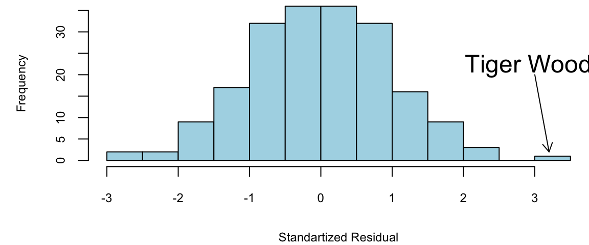
Regression: Variable selection
\(t\)-stats for nevents is \(<1.5\).
lm(formula = log(money) ~ drivedist + gir + avgputts, data = d00)
Call:
lm(formula = log(money) ~ drivedist + gir + avgputts, data = d00)

Coefficients:
(Intercept)    drivedist          gir     avgputts
    36.1737       0.0146       0.1658     -21.3684
The fewer the putts the better golfer you are. Duh!
avgputts per round is hard to decrease by one!
Evaluating the Coefficients
Greens in Regulation (GIR) has a \(\hat{\beta} = 0.17\). If I can increase my GIR by one, I’ll earn \(e^{0.17} = 1.18\)% An extra \(18\)%
DriveDis has a \(\hat{\beta} = 0.014\). A \(10\) yard improvement, I’ll earn \(e^{0.014 \times 10} =e^{0.14} = 1.15\)% An extra \(15\)%
Caveat: Everyone has gotten better since 2000!
Main Findings
Tiger was \(9\) standard deviations better than the model.
Taking logs of Money helps the residuals!
An exponential model seems to fit well. The residual diagnostics look good
The \(t\)-ratios for nevents are under \(1.5\).
Over-Performers
Outliers: biggest over and under-performers in terms of money winnings, compared with the performance statistics.
Woods, Mickelson, and Els won major championships by playing well when big money prizes were available.
Over-Performers
| name | money | Predicted | Error | |
|---|---|---|---|---|
| 1 | Tiger Woods | 9188321 | 3584241 | 5604080 |
| 2 | Phil Mickelson | 4746457 | 2302171 | 2444286 |
| 3 | Ernie Els | 3469405 | 1633468 | 1835937 |
| 4 | Hal Sutton | 3061444 | 1445904 | 1615540 |
| 20 | Notah Begay III | 1819323 | 426061 | 1393262 |
| 182 | Steve Hart | 107949 | -1186685 | 1294634 |
Under-Performers
Underperformers are given by large negative residuals Glasson and Stankowski should win more money.
| name | money | Predicted | Error | |
|---|---|---|---|---|
| 47 | Fred Couples | 990215 | 1978477 | -988262 |
| 52 | Kenny Perry | 889381 | 1965740 | -1076359 |
| 70 | Paul Stankowski | 669709 | 1808690 | -1138981 |
| 85 | Bill Glasson | 552795 | 1711530 | -1158735 |
| 142 | Jim McGovern | 266647 | 1397818 | -1131171 |
Lets look at 2018 data, the highest earners are
| name | nevents | money | drivedist | gir | avgputts |
|---|---|---|---|---|---|
| Justin Thomas | 23 | 8694821 | 312 | 69 | 1.7 |
| Dustin Johnson | 20 | 8457352 | 314 | 71 | 1.7 |
| Justin Rose | 18 | 8130678 | 304 | 70 | 1.7 |
| Bryson DeChambeau | 26 | 8094489 | 306 | 70 | 1.8 |
| Brooks Koepka | 17 | 7094047 | 313 | 68 | 1.8 |
| Bubba Watson | 24 | 5793748 | 313 | 68 | 1.8 |
Overperformers
| name | money | Predicted | Error | |
|---|---|---|---|---|
| 1 | Justin Thomas | 8694821 | 5026220 | 3668601 |
| 2 | Dustin Johnson | 8457352 | 6126775 | 2330577 |
| 3 | Justin Rose | 8130678 | 4392812 | 3737866 |
| 4 | Bryson DeChambeau | 8094489 | 3250898 | 4843591 |
| 5 | Brooks Koepka | 7094047 | 4219781 | 2874266 |
| 6 | Bubba Watson | 5793748 | 3018004 | 2775744 |
| 9 | Webb Simpson | 5376417 | 2766988 | 2609429 |
| 11 | Francesco Molinari | 5065842 | 2634466 | 2431376 |
| 12 | Patrick Reed | 5006267 | 2038455 | 2967812 |
| 84 | Satoshi Kodaira | 1471462 | -1141085 | 2612547 |
Underperformers
| name | money | Predicted | Error | |
|---|---|---|---|---|
| 102 | Trey Mullinax | 1184245 | 3250089 | -2065844 |
| 120 | J.T. Poston | 940661 | 3241369 | -2300708 |
| 135 | Tom Lovelady | 700783 | 2755854 | -2055071 |
| 148 | Michael Thompson | 563972 | 2512330 | -1948358 |
| 150 | Matt Jones | 538681 | 2487139 | -1948458 |
| 158 | Hunter Mahan | 457337 | 2855898 | -2398561 |
| 168 | Cameron Percy | 387612 | 3021278 | -2633666 |
| 173 | Ricky Barnes | 340591 | 3053262 | -2712671 |
| 176 | Brett Stegmaier | 305607 | 2432494 | -2126887 |
Findings
Here’s three interesting effects:
Tiger Woods is \(8\) standard deviations better!
Increasing driving distance by \(10\) yards makes you \(15\)% more money
Increasing GIR by one makes you \(18\)% more money.
Detect Under- and Over-Performers
Go Play!!